
Why use it:
- Faster to build: no need to define shared feature rows across plans; just list each plan’s features as simple text.
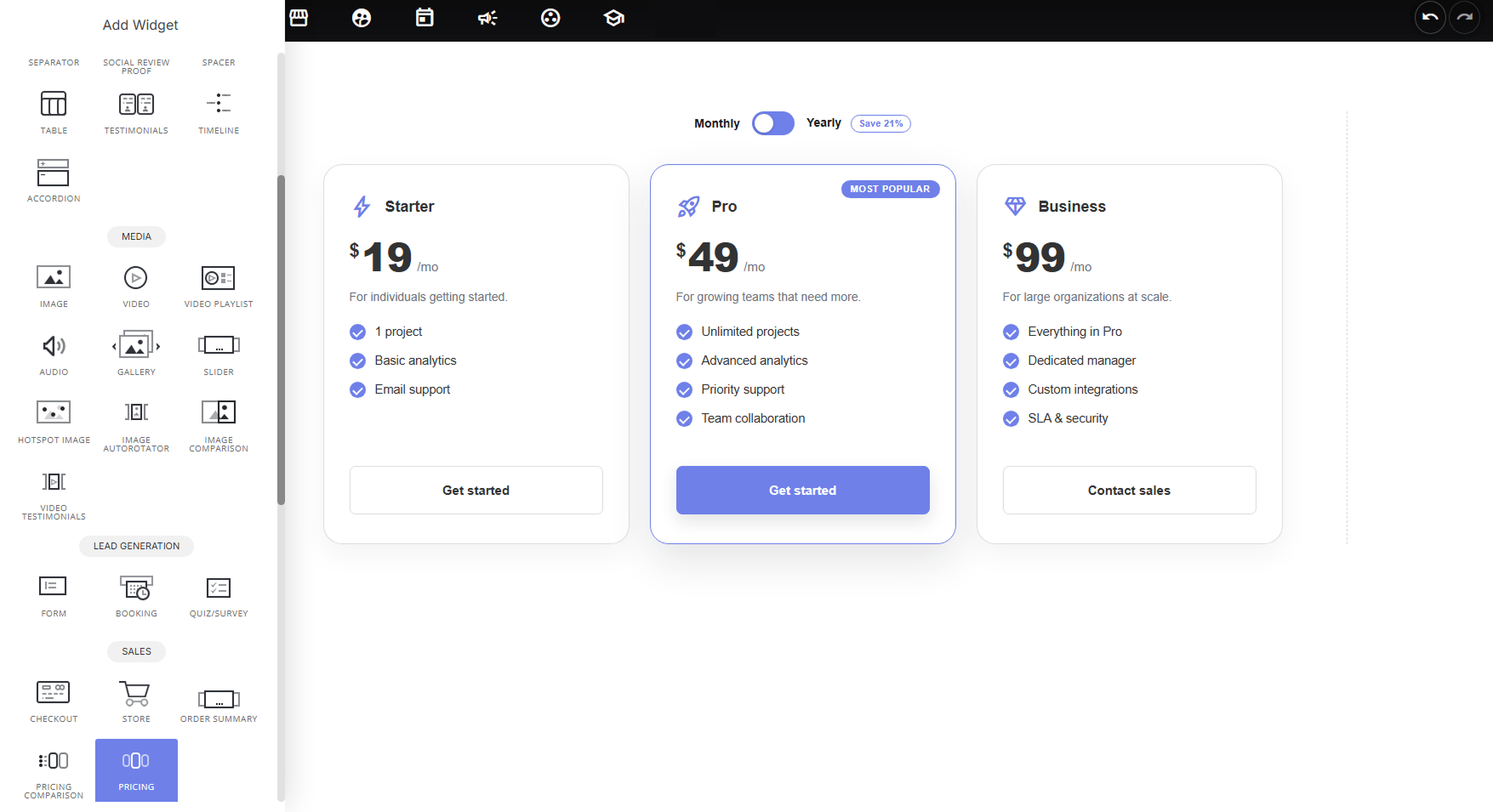
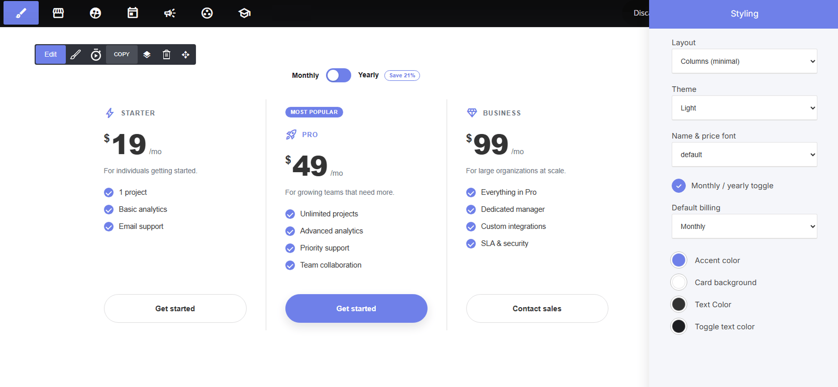
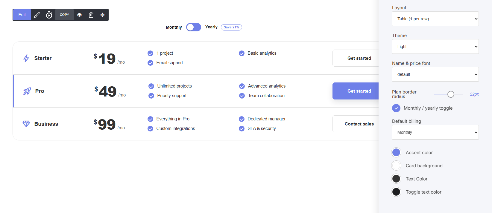
- More presentation flexibility: three distinct layouts let you match the widget to the page’s style, from a compact table to full pricing cards.
- Still fully featured: supports monthly/yearly toggle, “Most Popular” badges, and per-plan CTAs, just like the comparison widget.
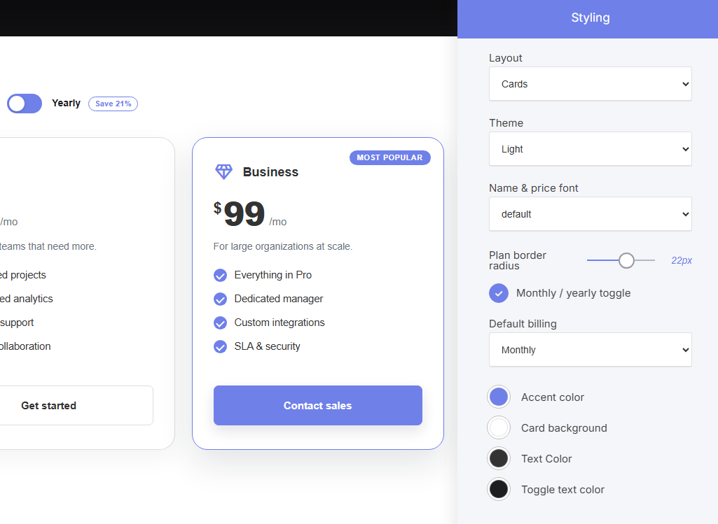
- Best for simpler pricing structures: ideal when plans don’t share identical feature sets or when you want each plan’s description to read more naturally (e.g., “For growing teams that need more”).
Layout Options:
Cards: plans display as bordered/elevated cards side by side, with the “Most Popular” plan visually emphasized. The most common, conversion-focused pricing layout.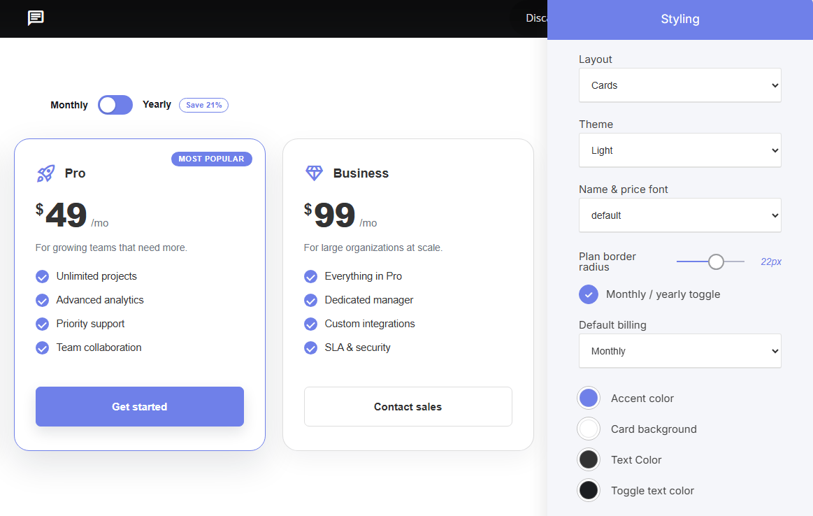
How to add plans
Manage plans in a list: click + Add to create a new plan, drag to reorder, click the gear to edit, or delete with the trash icon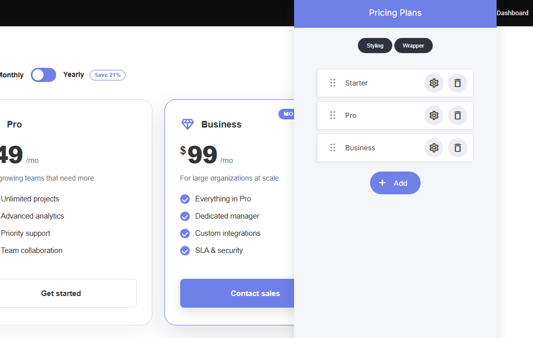
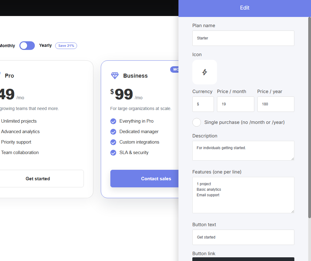
Per-plan settings:
- Plan name & Icon
- Currency, Price / month, Price / year
- Single purchase (no /month or /year): for one-time payment plans
- Description: short tagline under the price (e.g., “For growing teams that need more”)
- Features (one per line): free-text feature list, entered individually per plan
- Button text & Button link
Shared styling settings:
- Theme: Light/Dark
- Name & price font: typography control
- Plan border radius: corner rounding (Table/Cards layouts)
- Monthly / yearly toggle: show/hide the billing switch
- Default billing: which billing period displays by default
- Accent color, Card background, Text Color, Toggle text color: full color customization